DATA VISUALIZATION
DATA VISUALIZATION
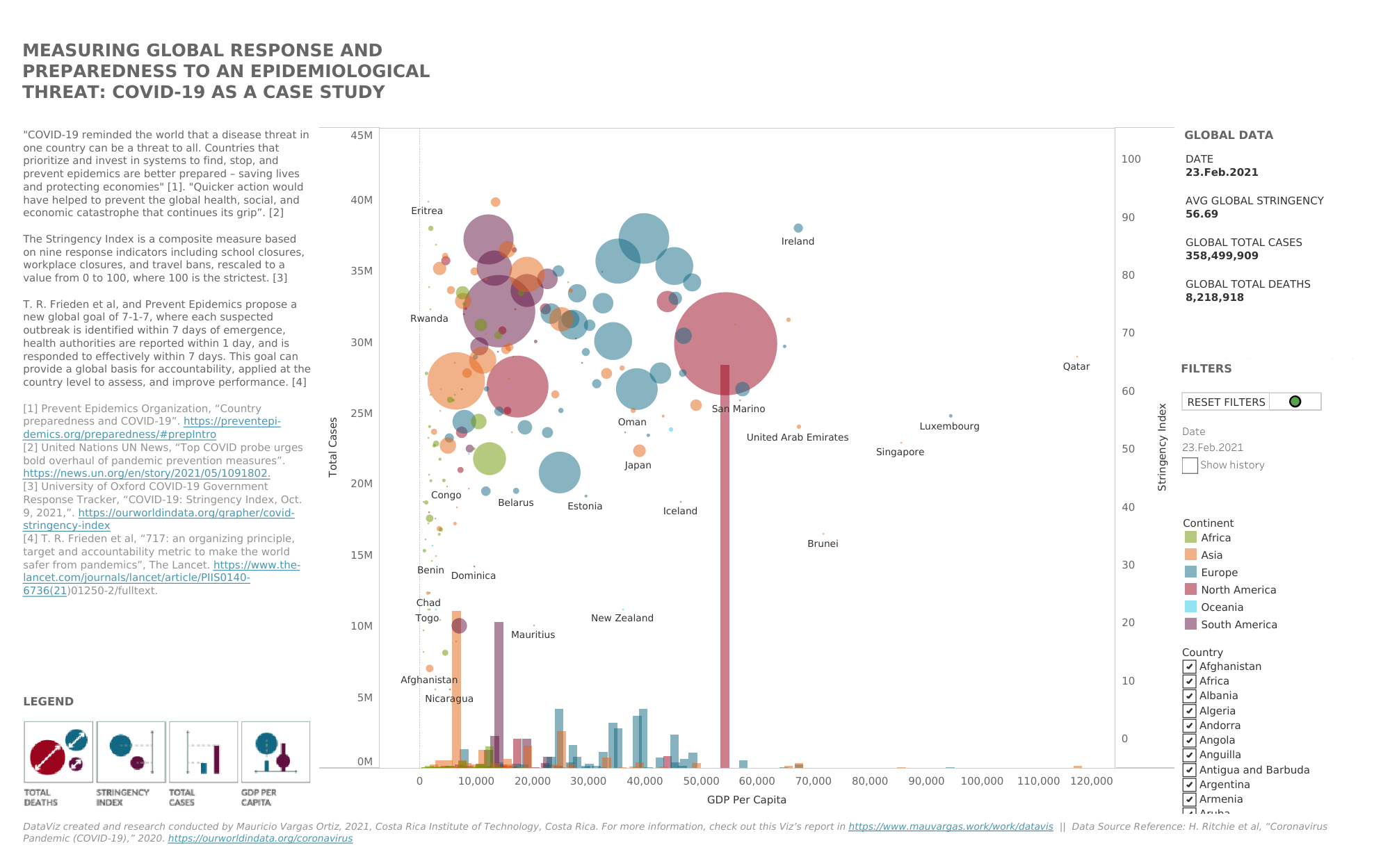
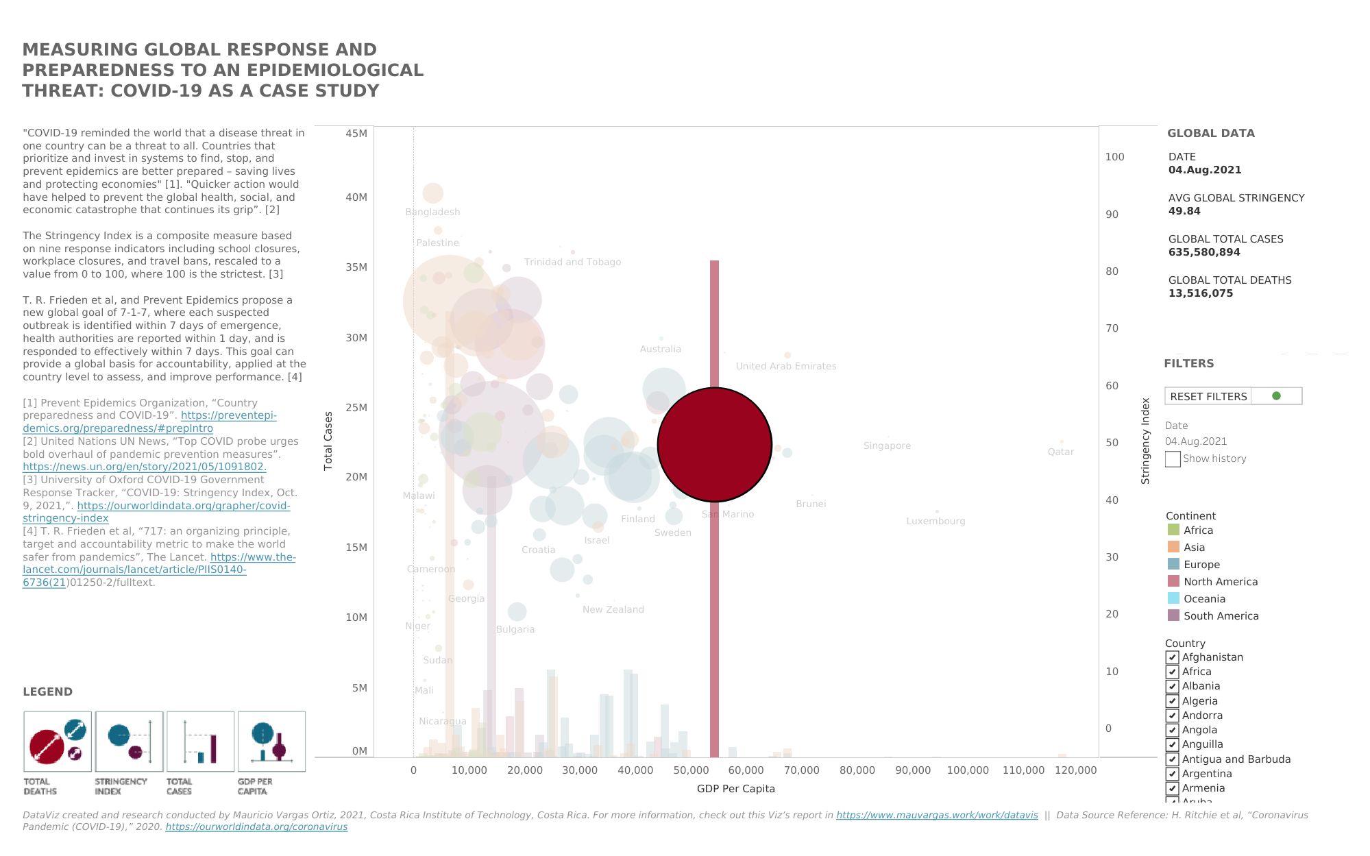
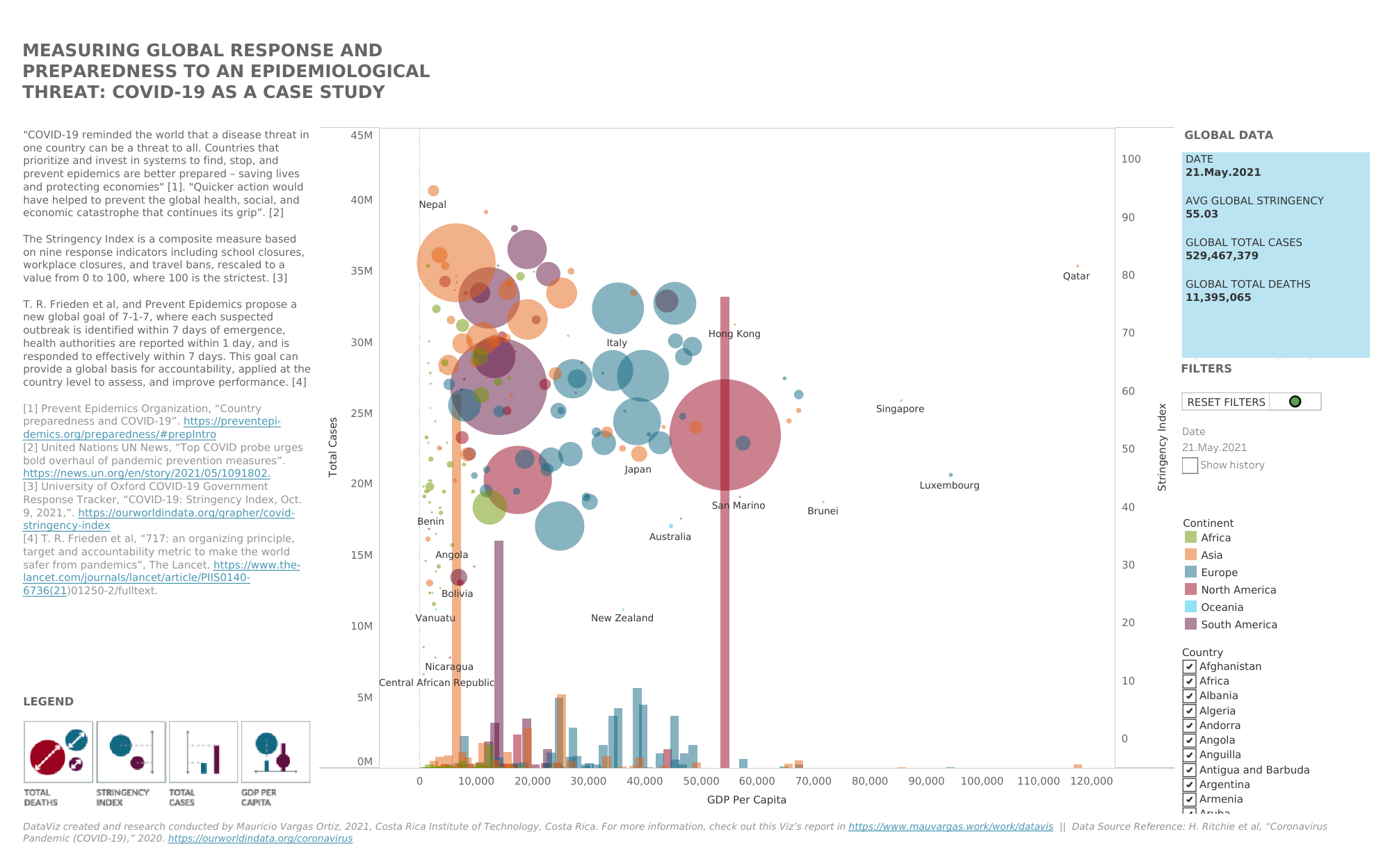
ANALYSIS OF THE GLOBAL PREPAREDNESS AND RESPONSE TO EPIDEMIOLOGICAL THREATS: COVID-19 AS A CASE STUDY - DATAVIZ
COVID-19 brought all the countries of the world to their knees. Among the responses of the countries, the preparation of each health system and the speed to take preventive actions against the uncontrolled transmission of the virus were essential. In addition, the preventive approaches taken to mitigate the transmission and consequently the excessive mortality of the virus as the days went by. This research project corresponds to the visualization of data from the analysis of the global response and preparedness for an epidemiological threat using COVID-19 as a case study.
The data visualization of this project aims to provide an effective way to establish relationships and conclusions between this economic reality, the actions taken, the speed with which these actions were taken after the detection of the first case and the subsequent balance between total cases and excessive mortality caused by the virus. Additionally, it includes a proposal for the evaluation of preparedness and response to epidemiological threats through the 7-1-7 scheme.
To check out the Live interactive DataViz available in Tableau Public, the Data Source, the Scientific Article (in Spanish), Project Report (in Spanish) and Presentation (in Spanish), please check out the following links:


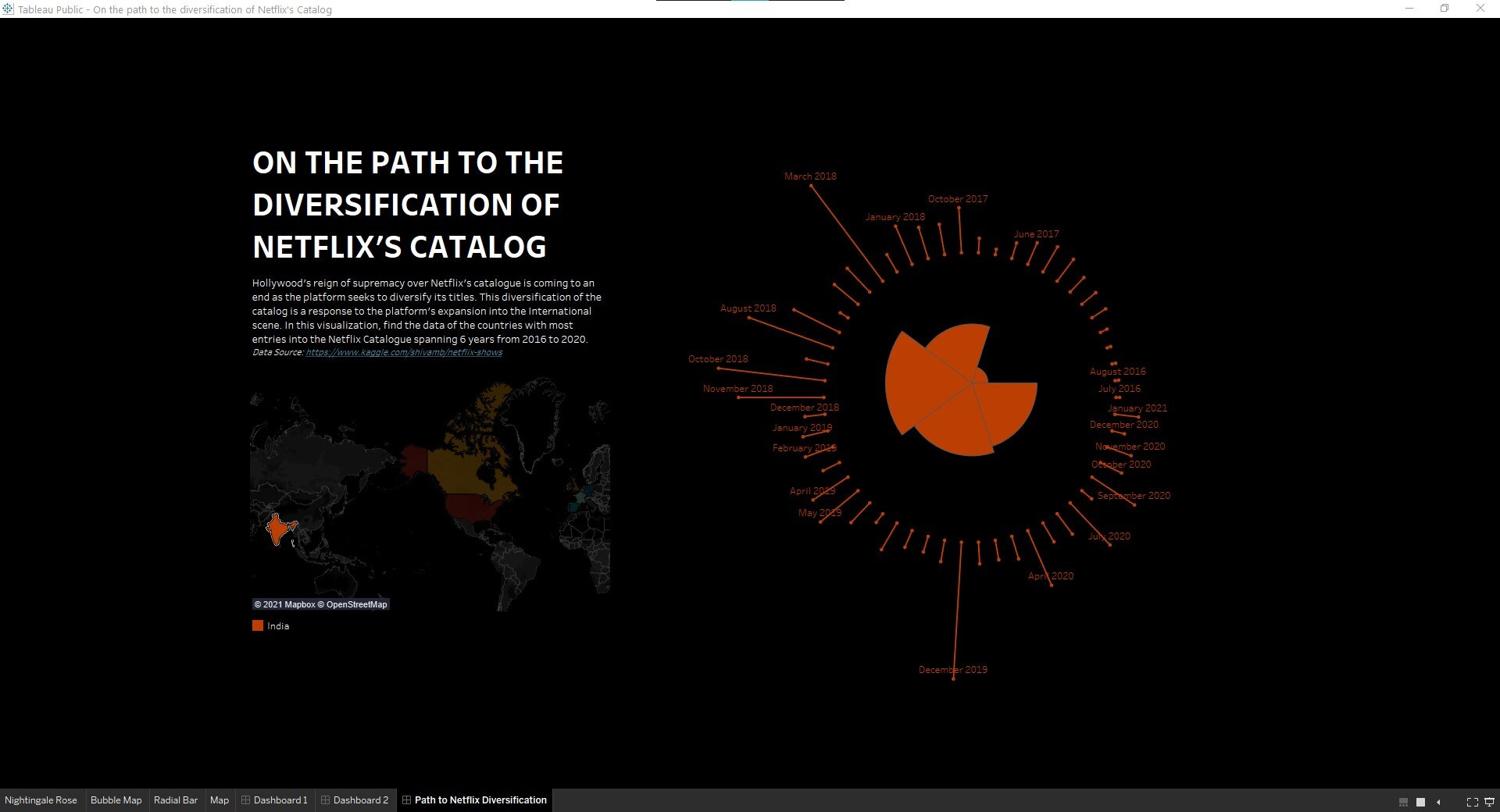
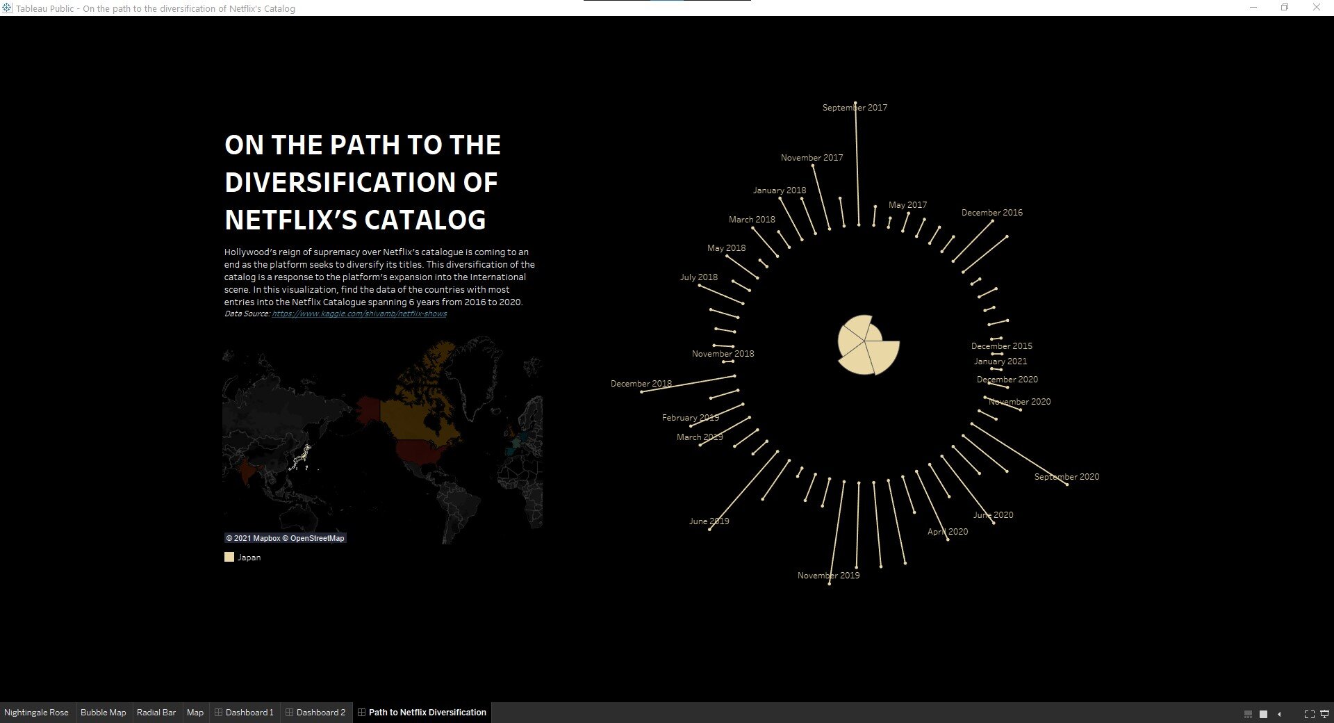
ON THE PATH TO THE DIVERSIFICATION OF NETFLIX’S CATALOGUE - DATAVIZ
Ever since the rise of the streaming service in both popularity and ease of access there have been comparison of the content across these platforms. These have been made firmly relying within the realm of studying the purpose of entertainment.
This article proposes a different approach, one that is rooted in how the characteristics of the streaming service have opened the floodgates of opportunity for smaller film and television industries generally classified as non-mainstream or non-Hollywood. This DataViz employs visualization paradigms of data analysis such as the Nightingale Rose diagram and the Radial Column chart.
To check out the Live interactive DataViz available in Tableau Public, the Data Source, the Scientific Article, please check out the following links:


MAPS AND TIMETABLES - SERVICE DESIGN PROJECT
These infographics were created as part of the informational elements employed in the Service Design project called “Design of the Signaletics and Visualization of the Public Railway Transport System of the Greater Metropolitan Area“. They are intended to portray the transit map and schedules in an easy and comprehensible way of understanding for users of the railway system.
INK - MÁQUINA DE TATUAR
This infographic illustrates a study of tattoos and the machine used to produce them in the fields of history, location, statistics, and other interesting information regarding the subject matter. All of the research for this project was conducted before as part of the design process as well as the illustration of the graphics that portray the information.
LA OFICINA NACIONAL DE AFS COSTA RICA
This infographic, on the other hand, illustrates the administrative structure of AFS Costa Rica’s National Office and methods in which the Organization’s Volunteer Force can contact each of the Staff. This infographic was created specifically for the Correspondant Coordinator training, as part of Volunteer training, that I participated in facilitating and creating.
¿CÓMO TRATAR UN CASO DE ABUSO O ACOSO SEXUAL?
This infographic deal with information on how to handle a case where a someone has had a case of sexual abuse or harassment. It imparts detailed information on how to identify, what to do if you are a victim, how to help a victim and warning signs. It was created for a training course as Support Coordinator at AFS.