BRANDING & PACKAGING
BRANDING & PACKAGING
TEQUILA, TACOS & MARIACHI RESTAURANTE
Project created for Tequila, Tacos & Mariachi Restaurante, an establishment located in Escazú, Costa Rica, and specialized in traditional Mexican cuisine, between the second semester of 2019 to the first semester of 2020. This project specifically presented a challenge of summarizing the entirety of Mexican culinary culture and the fact that Mexican food is classified as UNESCO World Heritage. The deliverable elements of this project included the design of the principal brand, a secondary brand called “Sabores Aztecas“; elements of composition for use in the walls of the restaurants featuring iconic characters and objects that represent the Mexican culture; printed elements like large and small signs, flyers, menus and other printed materia;, as well as digital ones such as social network presence (profile and cover pictures for Instagram and Facebook), social media posts for Instagram and Facebook, a UI/UX study for the website www.ttmmxcr.com (including features like the online menu, events and promotions feature, contact and location information, among others).


CAFÉ CERRO BIOLLEY - ASOMOBI
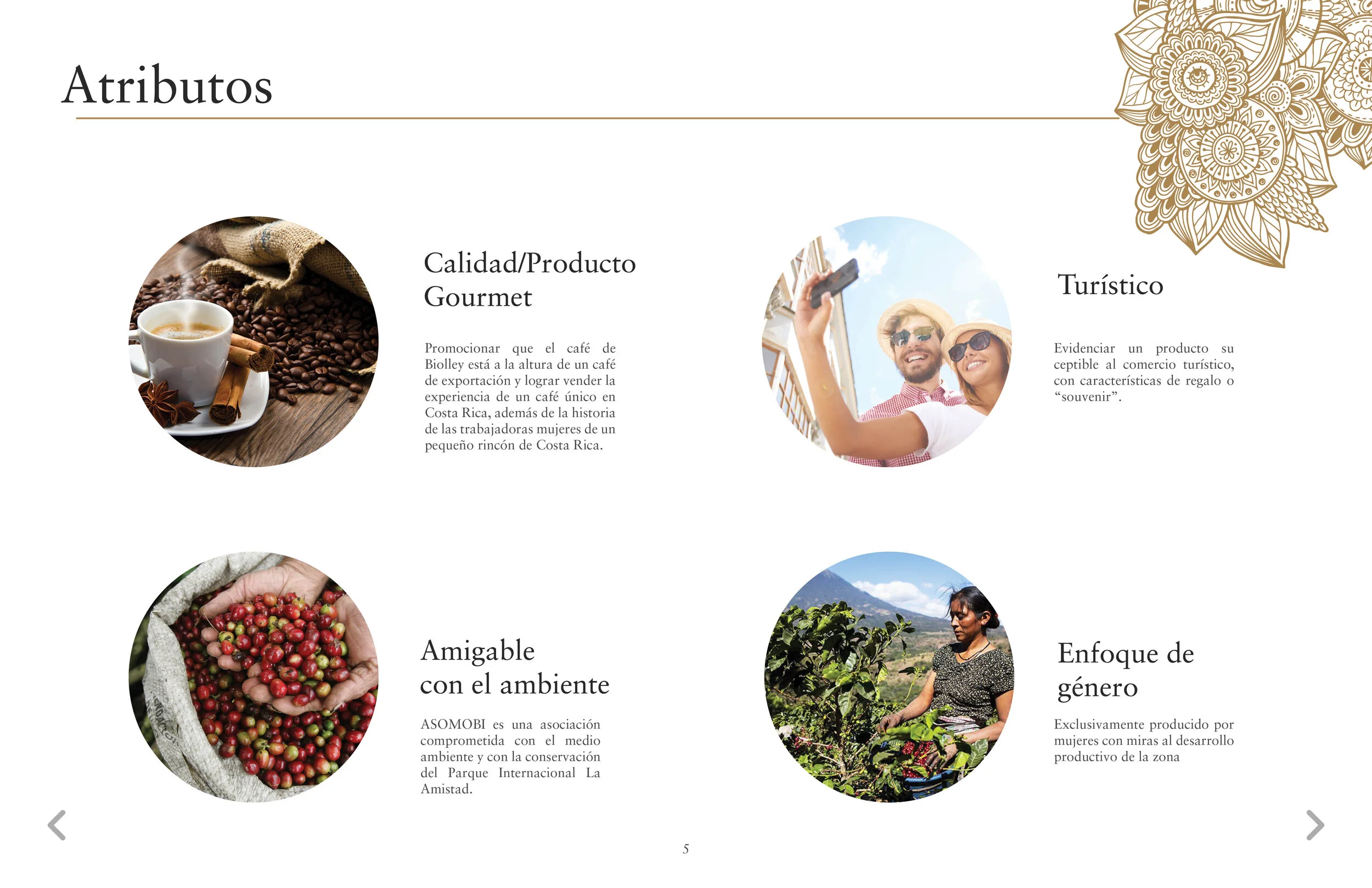
Project created for the Organized Women Association of Biolley (ASOMOBI as it’s known in spanish), a coffee roastery and producers located in the community of Biolley, in the District of Buenos Aires, Puntarenas Province, Costa Rica, 2016 to the present day. An idea brought to our attentions by the ladies of ASOMOBI, they wished to bring forth a new product, one that would showcase the values and integrity of their coffee as gourmet and elegant. They wished to market their new product to a target clientele of tourists who would take said product home as a gift; and they did this to broaden their market horizons beyond what they were already selling to Illy Coffee (a major European coffee seller) and for a more local market, taking advantage of Costa Rica’s heavily tourism influenced economy.
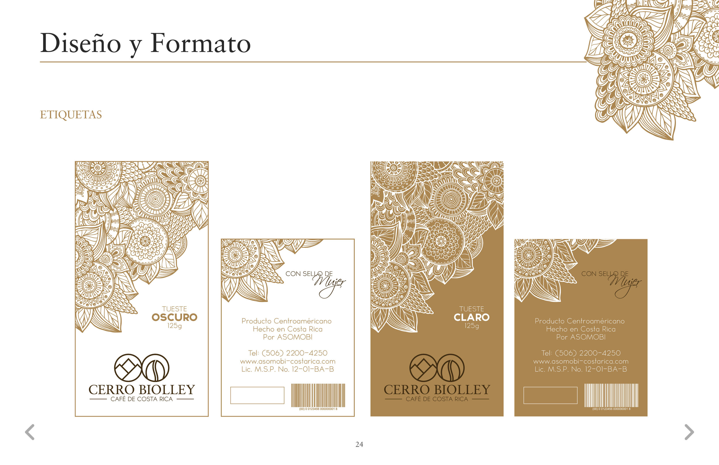
The unusual shape of the box is designed this way to attract the customer’s attention due to the way it sits on the shelf and in conjunction with more of them. Also, the pointed shape of the package on its side is intended to represent the peak of Cerro Biolley, the mountain after which the product and brand are named. Furthermore, the elements of the secondary graphic are intended to represent, and are inspired by, the wheels, known for their intricate designs, of the traditional Costa Rican oxcarts that for many years would transport the coffee from the producers to market and distribution.
This video was created to portray the design attributes which were requested by the clients, as well as to show the journey the product takes from the fields, to roasting, handling, and finally to the target audience: tourists and boutique shoppers. Disclaimer: some of the contents and audio of this video were given to us by the clients and thus all rights are reserved for their creators.


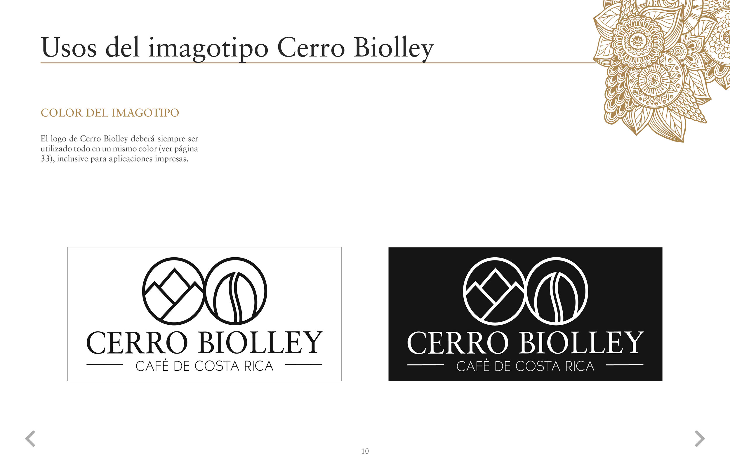
The elements of the brand identity were designed to represent the core characteristics of the brand: their location, on the slopes of Mount Biolley, and their business, coffee production and processing. It’s important to note that to the day of this publication, over 5000 of these packages have been produced an industrialized method of die cutting and commercialized. The elements designed were the brand identity, guidelines, labels and secondary packaging. This project was created and developed in collaboration with Marcelo Vargas Lobo, industrial designer. If you wish to know more about our joint works, please do contact me.
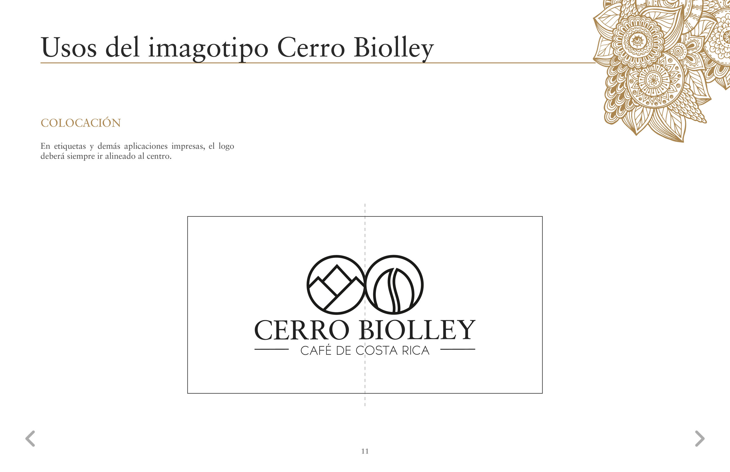
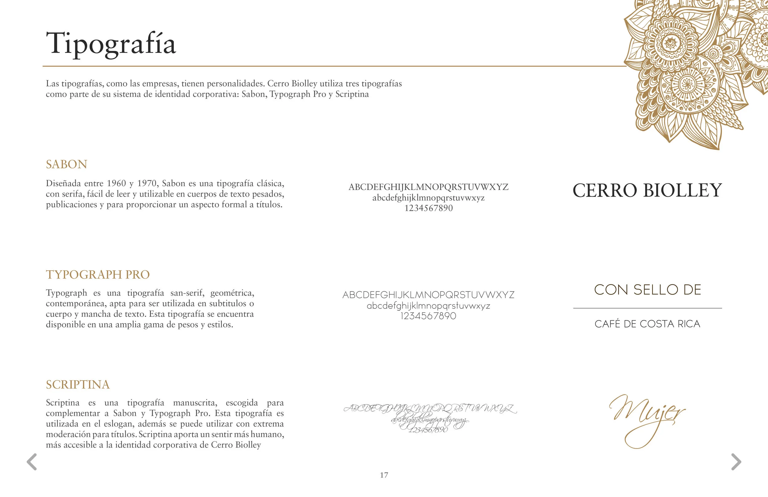
Below you can see some of the Brand Identity Guidelines for the Café Cerro Biolley Brand


COMITÉ SAN JOSÉ OESTE - AFS COSTA RICA
Branding project for the San José West Chapter (of which I am a volunteer) of AFS Costa Rica, an international, voluntary, non-governmental, non-profit organization that provides intercultural learning opportunities to help people develop the knowledge, skills and understanding needed to create a more just and peaceful world. Escazú, San José, Costa Rica, 2017 to the present day. The volunteer force of AFS Costa Rica is divided into chapters and the one I am assigned to is the San José West Chapter. This project was created in collaboration with Marisela Soto Salas, an architect and illustrator, for the use of the Chapter in its daily activities such as interaction on social media, products for activities like printed content and produced content, etc. The distinct elements and usages of this brand were created following the AFS International’s Brand Identity Guidelines.


The brand identity portrays representative elements of the Chapter’s territory (the western regions of the city of San José) such as the witch and mountains of Escazú, the wind power generators and onions of Santa Ana, the National Stadium, the Museum of Costarican Art and the trees of the La Sabana Metropolitan Park for San Jose.
Below you can find the Graphic Identity Guidelines for the Brand Identity of the San José West Chapter of AFS Costa Rica. It must be noted that this was done following the AFS Brand Identity Guidelines.


GRUPO DE ESPECIALIDADES MÉDICAS ALAJUELA - GEM
Branding project created for GEM Alajuela, a medical hospital and establishment located in the city of Alajuela, Costa Rica. The project comprised the design of the brand, external and internal signs for the Hospital’s departments, windows, and printed material like envelopes, stationary and flyers. This project was created in collaboration with Marcelo Vargas Lobo under our shared design studio initiative: MAVA Group.


OTHER BRAND LOGOS
These are other brand logos that I have made over the years